# P-values
<!-- paragraph -->
```{r setup, echo=FALSE}
knitr::opts_chunk$set(fig.path="ch19-figures/")
if(FALSE){
knitr::knit("index.qmd")
}
```
<!-- paragraph -->
In this chapter we will explore several data visualizations related to [P-values](https://en.wikipedia.org/wiki/P-value):
<!-- paragraph -->
- we begin by explaining the concept of a P-value.
<!-- comment -->
- we simulate some data for two-sample T-testing.
<!-- comment -->
- we show how to create a volcano plot to summarize a set of P-values.
<!-- comment -->
- we explain how to convert an overplotted scatterplot into a linked heat map and zoomed scatterplot.
<!-- comment -->
- we end with another heat map of simulated parameter values, with a linked plot which shows the simulated data.
<!-- paragraph -->
## What is a P-value?
<!-- comment -->
{#what-is-p-value}
<!-- paragraph -->
A P-value is used to measure significance of a statistical test.
<!-- comment -->
P-values can be used in a wide range of tests, but a typical application is testing for difference between two conditions:
<!-- paragraph -->
- in a medical experiment, does the treatment do better than the control?
<!-- comment -->
For example, with a weight loss drug, we would be interested to know if the treatment group weight is significantly less than the control group weight.
<!-- comment -->
Say we have 10 people assigned to the control group, and 15 people assigned to the treatment group.
<!-- comment -->
Then we could compute a P-value using an un-paired one-sided T-test to evaluate statistical significance (un-paired because each person in the treatment group does not have a corresponding member in the control group).
<!-- comment -->
- in a machine learning experiment, is the neural network more accurate than the linear model?
<!-- comment -->
For example, consider a benchmark image classification data set, and evaluation using 5-fold cross-validation.
<!-- comment -->
We would have five measures of test accuracy for each of the two learning algorithms (neural network and linear model).
<!-- comment -->
Then we could compute a P-value using a paired one-sided T-test to evaluate statistical significance (paired because the fold 1 test accuracy for the linear model has a corresponding fold 1 test accuracy for the neural network, etc).
<!-- paragraph -->
After computing the measurements (weight of each person or test accuracy of each machine learning algorithm), we can use them as input to `t.test()`, which will compute a P-value (smaller for a more significant difference).
<!-- comment -->
To understand the P-value, we must first adopt the *null hypothesis*: we assume there is no difference between the conditions.
<!-- comment -->
Then, the P-value of the test is defined as the probability that we observe a difference as large as the given measurements, or larger.
<!-- comment -->
Since under the null hypothesis, there is no difference, it is extremely unlikely to see large differences, so that is why small P-values are more significant.
<!-- paragraph -->
## Simulated data {#p-value-simulated-data}
<!-- paragraph -->
We begin by simulating data for use with `t.test()`.
<!-- comment -->
Our simulation has four parameters:
<!-- paragraph -->
- `true_offset` is the true difference between conditions,
- `sd` is the standard deviation of the simulated data,
- `sample` is a sample number (half of samples in one condition, half in the other),
- `trial` is the number of times that we repeat the experiment (for each offset and standard deviation).
<!-- paragraph -->
The code below uses `CJ()` to define the values of each parameter:
<!-- paragraph -->
```{r}
library(data.table)
offset_by <- 0.1
sd_by <- 0.1
set.seed(1)
(sim_dt <- CJ(
  true_offset=round(
    seq(-3, 3, by=offset_by),
    ceiling(-log10(offset_by))),
  sd=seq(0.1, 1, by=sd_by),
  sample=seq(0, 9),
  trial=seq_len(100)
)[, let(
  condition = sample %% 2,
  pair = sample %/% 2
)][, let(
  value = rnorm(.N, true_offset*condition, sd)
)][])
```
<!-- paragraph -->
The result above shows several hundred thousand rows, one for each simulated random normal `value` (with mean depending on `true_offset` and `condition`).
<!-- paragraph -->
## T-test and volcano plot {#t-test-and-volcano-plot}
<!-- paragraph -->
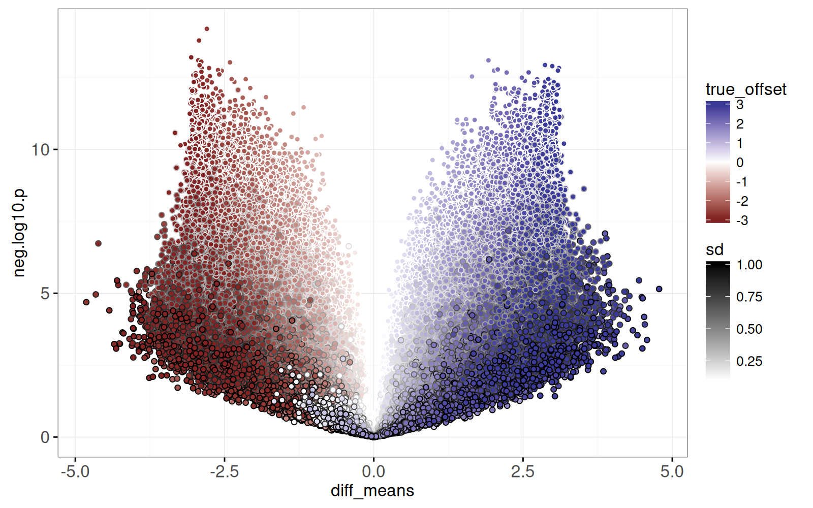
In this section we compute T-test results and visualize them using a volcano plot, which is a plot of negative log P-values versus estimated effect sizes.
<!-- comment -->
The test result visualization is called a volcano plot because the typical distribution of points resembles a volcano erupting from the origin upwards to the left and right.
<!-- comment -->
First, we add columns which we will use for visualization:
<!-- paragraph -->
- `true_tile` is a text string for selecting a combination of one offset and one standard deviation.
<!-- comment -->
- `Condition` is a string indicating the condition (either `zero` or `offset`).
<!-- paragraph -->
```{r}
sim_dt[, let(
  true_tile=paste(true_offset, sd),
  Condition = ifelse(condition, "offset", "zero")
)]
```
<!-- paragraph -->
Next, we do a reshape to obtain a table with a column for each condition (`zero` and `offset`).
<!-- paragraph -->
```{r}
(sim_wide <- dcast(
  sim_dt,
  true_tile + true_offset + sd + trial + pair ~ Condition))
```
<!-- paragraph -->
The output above shows a table with half as many rows as the previous table.
<!-- comment -->
The code below computes a T-test for each repetition of the simulation:
<!-- paragraph -->
```{r}
(sim_p <- sim_wide[, {
  t.result <- t.test(zero, offset, var.equal=TRUE)
  with(t.result, data.table(
    p.value,
    mean_zero=estimate[1],
    mean_offset=estimate[2]
  ))
}, by=.(true_tile, true_offset, sd, trial)])
```
<!-- paragraph -->
The output above has one row for each T-test, and columns for mean difference (`mean_zero`) and `p.value`.
<!-- comment -->
Since there are ten samples per trial, there are ten times fewer rows than the original simulated data table.
<!-- comment -->
Each trial involves a T-test of 5 control/zero samples, versus 5 treatment/offset samples.
<!-- comment -->
Next, we add columns for the volcano plot:
<!-- paragraph -->
- `diff_means` is the difference between means of the two conditions, sometimes called the "effect size."
- `neg.log10.p` is the negative log-transformed P-value (larger for more significant).
<!-- paragraph -->
```{r}
sim_p[, let(
  diff_means = mean_offset - mean_zero,
  neg.log10.p = -log10(p.value)
)]
```
<!-- paragraph -->
Next, we draw the volcano plot:
<!-- paragraph -->
- X axis shows the difference between conditions (effect size).
<!-- comment -->
- Y axis shows negative log P-value.
<!-- paragraph -->
```{r}
library(animint2)
(gg.volcano <- ggplot()+
  geom_point(aes(
    diff_means, neg.log10.p, fill=true_offset, color=sd),
    data=sim_p)+
  scale_fill_gradient2()+
  scale_color_gradient(low="white", high="black")+
  theme_bw())
```
<!-- paragraph -->
The static graphic above shows one dot per T-test result.
<!-- comment -->
Dots close to the origin (0,0) represent tests which did not yield a significant difference, whereas dots with large Y values represent significant differences.
<!-- comment -->
It also includes `fill=true_offset` and `color=sd` so we can see how the simulation parameters affect the volcano plot:
<!-- paragraph -->
- Larger `sd` values appear at the bottom (more variance makes it more difficult to detect a difference).
<!-- comment -->
- Darker colors appear near the left/right edges (larger true offsets tend to result in larger computed differences in means).
<!-- paragraph -->
Finally, the plot above is overplotted, meaning we are unable to see all of the details, because there are too many data points plotted on top of one another.
<!-- paragraph -->
## Fix overplotting by heat map and zoom {#fix-overplotting-heatmap-zoom}
<!-- paragraph -->
In this section, we show how the previous volcano plot can be revised to show more detail, using a heat map linked to a zoomed scatterplot.
<!-- comment -->
To begin, we define the `round_rel()` function below, which is used to add `round_*` and `rel_*` columns which we will use to define heat map tiles.
<!-- paragraph -->
- `round_*` columns are rounded to the nearest bin size (integer by default), and are used to define the heat map tile `x` and `y` positions.
<!-- comment -->
- `rel_*` columns are used for `x` and `y` positions in the zoomed display, and are units relative to the corresponding `round_*` values.
<!-- paragraph -->
```{r}
round_rel <- function(DT, col_name, bin_size=1, offset=0){
  value <- DT[[col_name]]
  round_value <- round((value+offset)/bin_size)*bin_size
  DT[, paste0(c("round","rel"), "_", col_name) := list(
    round_value, value-round_value)]
}
round_rel(sim_p, "diff_means")
round_rel(sim_p, "neg.log10.p")
```
<!-- paragraph -->
Next, we define `volcano_tile`, a text string combination of `round_*` variables, which will be used for selection.
<!-- paragraph -->
```{r}
sim_p[, volcano_tile := paste(round_diff_means, round_neg.log10.p)]
```
<!-- paragraph -->
Next, we compute a table with one row per tile in the heat map we will display.
<!-- paragraph -->
```{r}
(volcano_tile_dt <- sim_p[, .(
  tests=.N
), by=.(volcano_tile, round_diff_means, round_neg.log10.p)])
```
<!-- paragraph -->
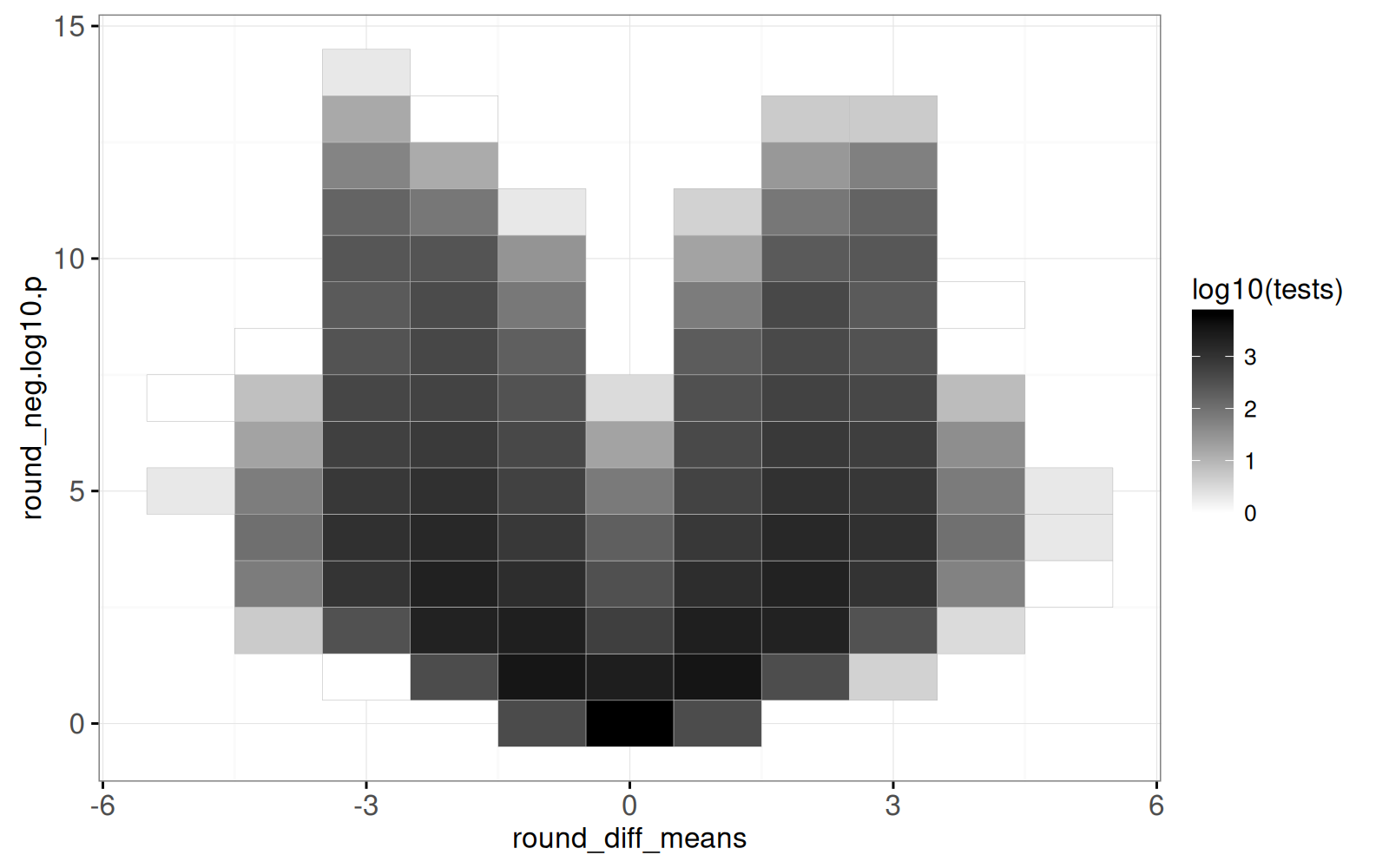
The output above shows one row per heat map tile, with the `tests` column indicating how many points appear in the corresponding area of the volcano plot.
<!-- comment -->
Below we create the volcano heat map.
<!-- paragraph -->
```{r}
(gg.volcano.tiles <- ggplot()+
  geom_tile(aes(
    round_diff_means, round_neg.log10.p, fill=log10(tests)),
    color="grey",
    data=volcano_tile_dt)+
  scale_fill_gradient(low="white",high="black")+
  theme_bw())
```
<!-- paragraph -->
The output above is a heat map, with darker regions showing areas of the volcano plot which have more test results.
<!-- comment -->
The code below combines the volcano heat map with a zoomed scatterplot, using the `volcano_tile` selector to link them.
<!-- paragraph -->
```{r ch19-viz-volcano}
(viz.volcano <- animint(
  volcanoTiles=gg.volcano.tiles+
    ggtitle("Click to select volcano tile")+
    theme_animint(width=300, rowspan=1)+
    geom_tile(aes(
      round_diff_means, round_neg.log10.p),
      clickSelects="volcano_tile",
      color="green",
      fill="transparent",
      data=volcano_tile_dt),
  volcanoZoom=ggplot()+
    ggtitle("Zoom to selected volcano tile")+
    geom_point(aes(
      rel_diff_means, rel_neg.log10.p, fill=true_offset, color=sd),
      showSelected="volcano_tile",
      size=3,
      data=sim_p)+
    scale_fill_gradient2()+
    scale_color_gradient(low="white", high="black")+
    theme_bw()))
```
<!-- paragraph -->
Above, after clicking the heat map on the left, the data shown in the right plot changes.
<!-- paragraph -->
## Visualizing grid of simulations {#viz-grid-simulations}
<!-- paragraph -->
In this section, we create a new visualization to reveal details of each simulation parameter combination.
<!-- comment -->
First, in the code below, we compute the mean effect size (`diff_means`) and negative log P-value (`neg.log10.p`), over all 100 repetitions of each parameter combination.
<!-- paragraph -->
```{r}
(sim_true_tiles <- dcast(
  sim_p,
  true_tile + true_offset + sd ~ .,
  mean,
  value.var=c("diff_means", "neg.log10.p")))
```
<!-- paragraph -->
The output above has one row per combination of simulation parameters (`true_offset` and `sd`).
<!-- comment -->
We use the code below to visualize this grid of parameter combinations.
<!-- paragraph -->
```{r}
width <- offset_by*0.4
height <- sd_by*0.45
(gg.true.tiles <- ggplot()+
  scale_x_continuous("True offset")+
  scale_y_continuous("Standard deviation")+
  scale_fill_gradient2(breaks=c(3,0,-3))+
  scale_color_gradient(
    guide=guide_legend(override.aes=list(fill='white')),
    low="white", high="black", breaks=c(9,5,1))+
  theme_bw()+
  geom_rect(aes(
    xmin=true_offset-width, xmax=true_offset+width,
    ymin=sd-height, ymax=sd+height,
    fill=diff_means, color=neg.log10.p),
    data=sim_true_tiles))
```
<!-- paragraph -->
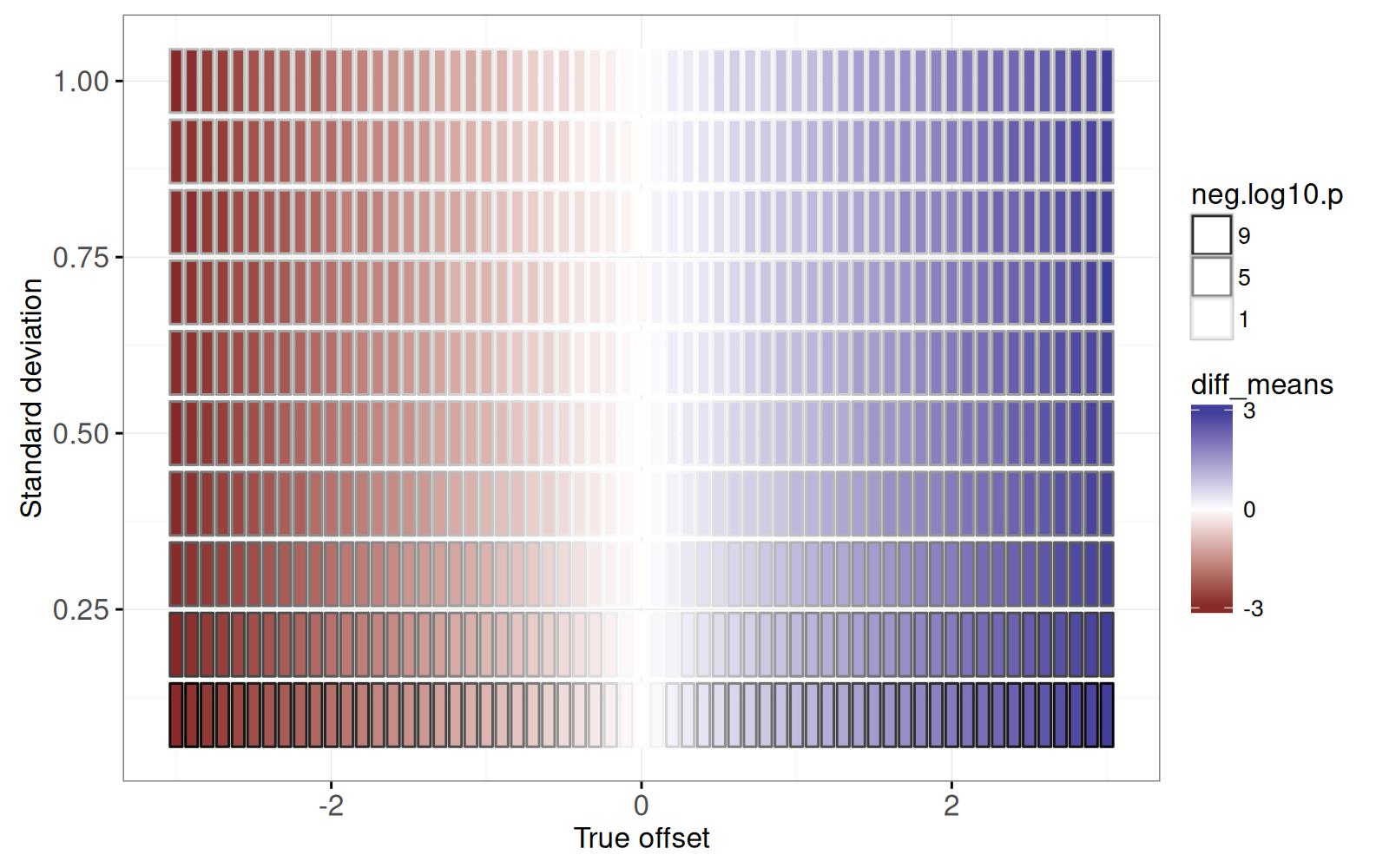
The figure above shows a rectangle for each simulation parameter combination.
<!-- comment -->
It is clear that:
<!-- paragraph -->
- the estimated effect size (`fill=diff_means`) is consistent with the true offset (X axis).
<!-- comment -->
- the more significant P-values (large `neg.log10.p`) are associated with small standard deviation parameters (because the signal to noise ratio is larger).
<!-- paragraph -->
We will create a linked plot that shows details of the simulations for each parameter combination.
<!-- comment -->
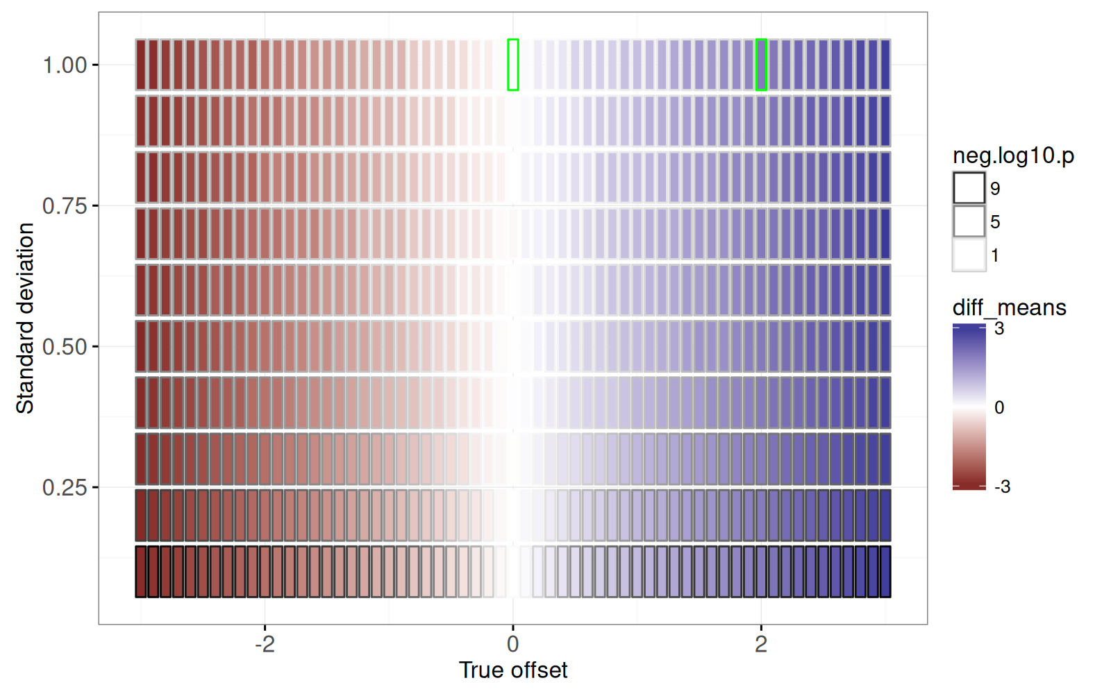
First we prototype the details plots by examining a subset:
<!-- paragraph -->
```{r}
some <- function(DT)DT[true_offset %in% c(0,2) & sd == 1]
gg.true.tiles+
  geom_rect(aes(
    xmin=true_offset-width, xmax=true_offset+width,
    ymin=sd-height, ymax=sd+height),
    color="green",
    fill=NA,
    data=some(sim_true_tiles))
```
<!-- paragraph -->
The figure above shows two rectangles emphasized with a green outline, for which we create a facetted non-interactive plot using the code below.
<!-- paragraph -->
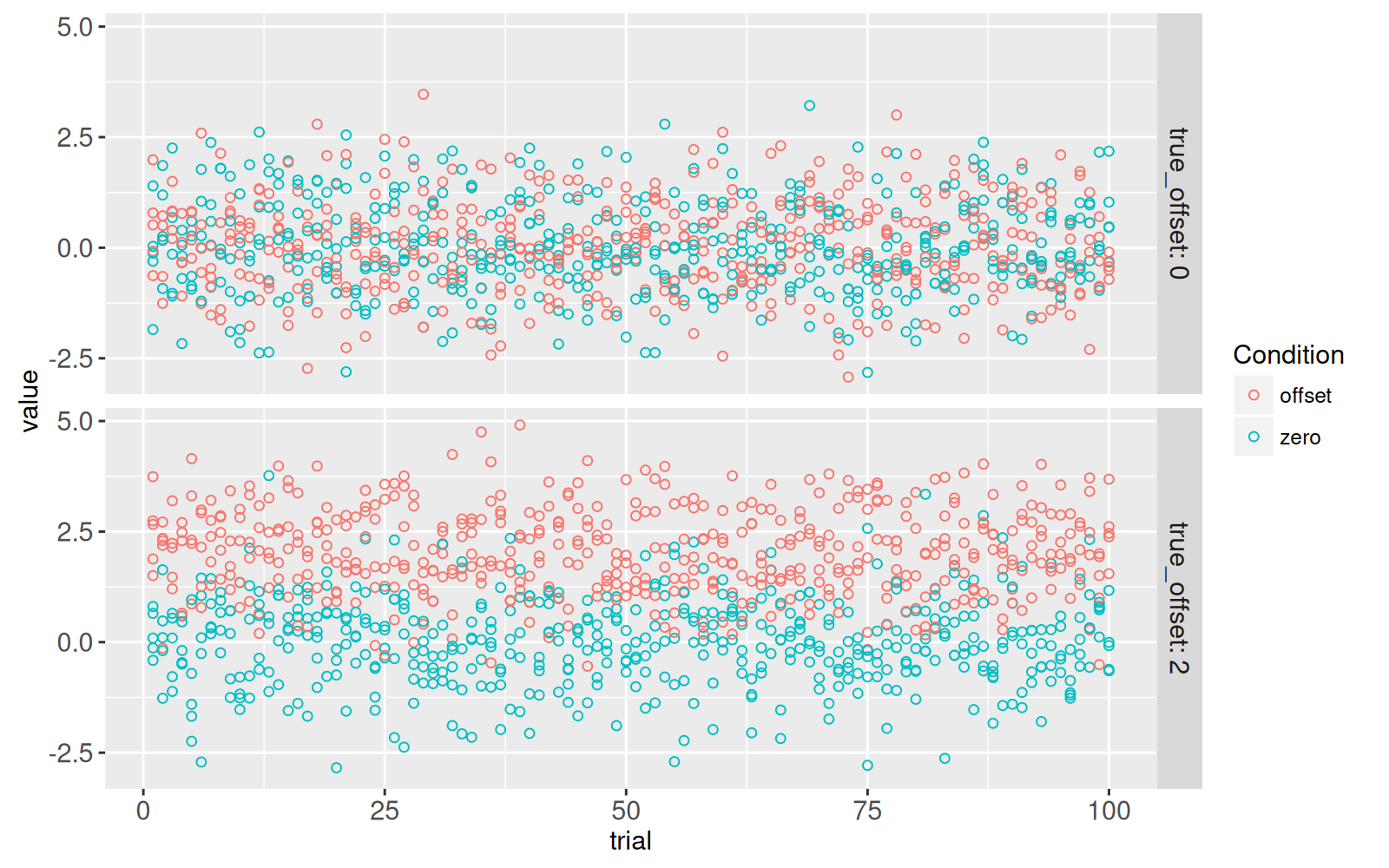
```{r}
(gg.some.values <- ggplot()+
  facet_grid(true_offset ~ ., labeller=label_both)+
  geom_point(aes(
    trial, value, color=Condition),
    data=some(sim_dt)))
```
<!-- paragraph -->
The figure above shows a panel for each of the two parameter combinations emphasized in the previous plot.
<!-- comment -->
The X axis represents `trial`, which ranges from 1 to 100, each one with different random values simulated using the same assumptions (`true_offset=0` or `2`).
<!-- comment -->
The T-test is used to determine if there is any difference in means, between the two conditions.
<!-- paragraph -->
- When `true_offset=0`, there is no difference between the two conditions, so the T-test should have a small effect size, and a large P-value.
<!-- comment -->
- When `true_offset=2`, there is a larger difference between the two conditions, so the T-test should have a larger effect size, and a small P-value.
<!-- paragraph -->
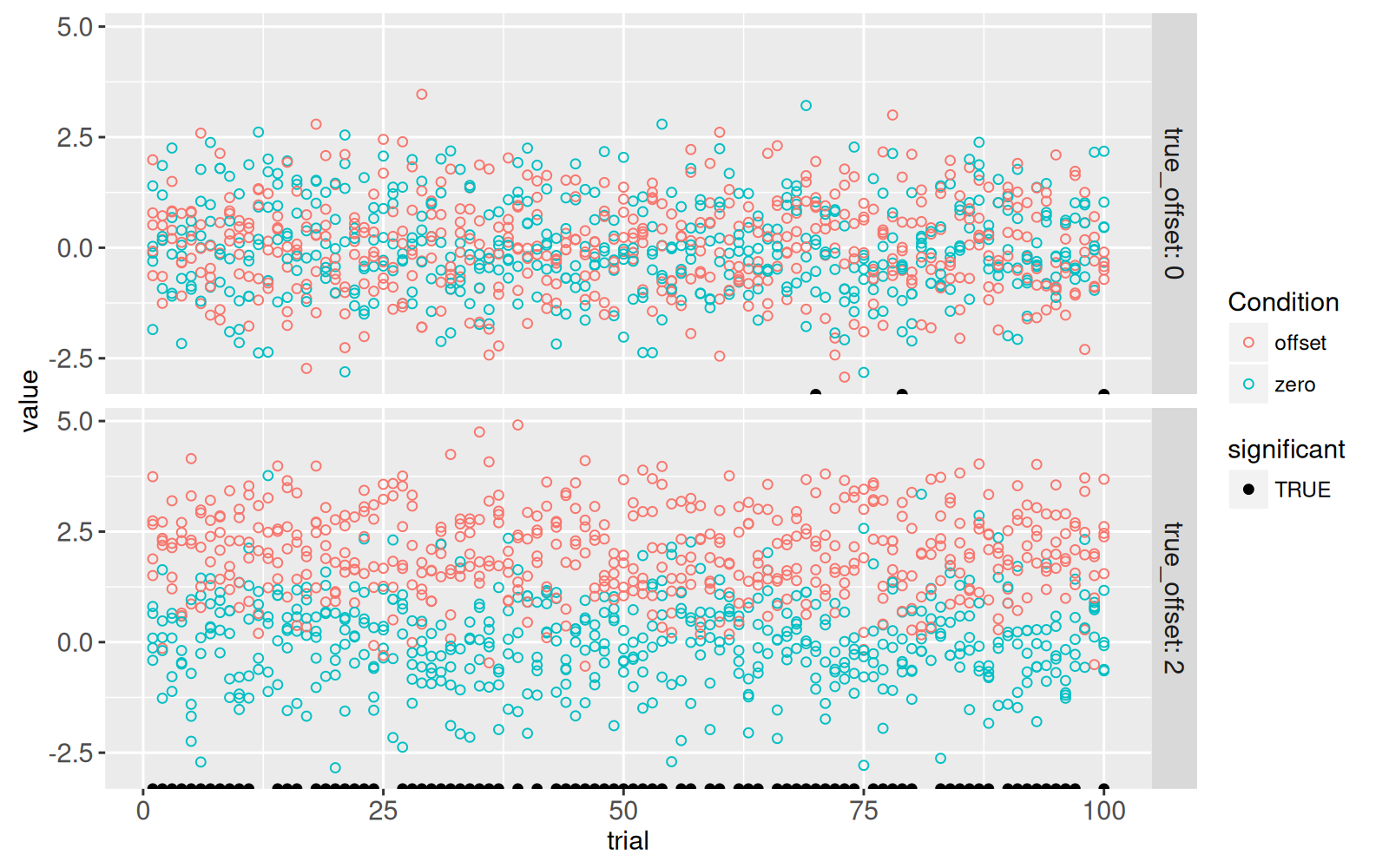
The code below creates a new `significant` column which indicates if the test rejects the null hypothesis at the traditional threshold of 5%.
<!-- paragraph -->
```{r}
sim_p[, significant := p.value < 0.05]
```
<!-- paragraph -->
The code below adds a new `geom_point()` to emphasize the trials which showed a significant difference at the 5% level.
<!-- paragraph -->
```{r}
only_significant <- sim_p[significant==TRUE]
gg.some.values+
  geom_point(aes(
    trial, -Inf, fill=significant),
    data=some(only_significant))+
  scale_fill_manual(values=c("TRUE"="black"))
```
<!-- paragraph -->
The figure above shows a black dot for each trial with a significant difference.
<!-- paragraph -->
- For `true_offset=0`, we see that there are `r nrow(some(only_significant)[true_offset==0])` trials with a significant difference, even though there is no difference in the true means in the simulation.
<!-- comment -->
This number of false positives is consistent with the 5% P-value threshold (type I error rate) that we used to define significance.
<!-- comment -->
- For `true_offset=2`, we see that only `r nrow(some(only_significant)[true_offset!=0])` of the trials are significant, even though there is a true difference in means.
<!-- comment -->
The estimated power (true positive rate) is therefore `r some(sim_p)[true_offset!=0, paste0(100*mean(significant),"%")]` and the type II error rate (false negative rate) is therefore `r some(sim_p)[true_offset!=0, paste0(100*mean(1-significant),"%")]`.
<!-- paragraph -->
Below we create a visualization which links the overview heat map to the details scatter plot, by replacing `facet_grid(true_offset ~ .)` in the code above, with `showSelected="true_tile"` in the code below.
<!-- paragraph -->
```{r ch19-viz-true-tiles}
(viz.parameters <- animint(
  tiles=gg.true.tiles+
    ggtitle("Click to select simulation parameters")+
    theme_animint(width=800, height=250, last_in_row=TRUE)+
    geom_rect(aes(
      xmin=true_offset-width, xmax=true_offset+width,
      ymin=sd-height, ymax=sd+height),
      fill="transparent",
      color="green",
      clickSelects="true_tile",
      data=sim_true_tiles),
  zoom=ggplot()+
    ggtitle("Zoom to selected simulation parameters")+
    theme_bw()+
    theme_animint(width=800, height=300)+
    geom_point(aes(
      trial, value, color=Condition),
      fill=NA,
      showSelected="true_tile",
      data=sim_dt)+
    geom_point(aes(
      trial, -Inf, fill=significant),
      showSelected="true_tile",
      data=only_significant)+
    scale_fill_manual(values=c("TRUE"="black"))))
```
<!-- paragraph -->
In the visualization above, you can click on the top plot to select a simulation parameter combination.
<!-- comment -->
The 100 trials for the selected parameter combination are shown in the bottom plot.
<!-- paragraph -->
## Chapter summary and exercises {#ch19-exercises}
<!-- paragraph -->
We have created several data visualizations using simulations to illustrate P-values.
<!-- comment -->
Since there were too many T-tests to show on the volcano plot, we instead used a heat map linked to a zoomed scatter plot.
<!-- comment -->
We also showed how to link a heat map of parameter combinations to a scatter plot which shows details of the corresponding values in the simulations.
<!-- paragraph -->
Exercises:
<!-- paragraph -->
- In `viz.volcano`, when clicking on one of the bottom `volcanoTiles`, we see only have of the space occupied in `volcanoZoom`.
<!-- comment -->
To fix this, and have all of the space occupied, go back to the definition of `round_neg.log10.p`, and use the `offset=0.5` argument in `round_rel()`, which will shift the relative values by a certain offset.
<!-- comment -->
- In `viz.volcano`, add `aes(tooltip)` to `volcanoTiles` to show how many points are in each heat map tile.
<!-- comment -->
- Note how two `geom_tile()` were used in `viz.volcano`, and two `geom_rect()` were used in `viz.parameters`.
<!-- comment -->
The first geom uses color and fill to visualize the data, whereas the second geom uses `fill="transparent"` with `color="green"` for selection.
<!-- comment -->
Try a re-design with only one geom, which only uses `aes(fill)` and instead uses `color` as a geom parameter.
<!-- comment -->
What are the disadvantages of the approach using only one geom?
<!-- comment -->
- In `viz.parameters`, add `geom_hline()` to emphasize the selected value of the true offset.
<!-- comment -->
- In `viz.parameters$zoom`, add `geom_segment()` to represent the difference between means in each trial, using `aes(linetype=signficant)` to show which differences are significant at the traditional P-value threshold of `0.05`.
<!-- comment -->
- In `viz.parameters$zoom`, add `geom_point()` to represent the mean in each trial and condition.
<!-- comment -->
Hint: you can either add two instances of `geom_point()`, or one `geom_point()` with a longer data table created via `melt(sim_p, measure.vars=measure(Condition, sep="mean_(.*)"))`.
<!-- comment -->
- Add graphical elements to `gg.volcano` to emphasize the traditional P-value threshold of `0.05`: `geom_hline()` can show the threshold, and `geom_text()` can show how many tests fall above or below the threshold (use text like "1500 tests not significant").
<!-- comment -->
- Add `aes(tooltip)` to `gg.true.tiles` to show values of `neg.log10.p` and `diff_means`.
<!-- comment -->
- Add animation to `viz.parameters` so that we see a new parameter combination every second.
<!-- comment -->
- Add `first` option to `viz.parameters` so that the first selection we see is the same as one of the parameter combinations shown in the static facetted plot.
<!-- comment -->
- Combine `viz.volcano` with `viz.parameters` to create a new data visualization with four linked plots.
<!-- comment -->
Different kinds of interactions are possible: - In `volcanoZoom`, use `clickSelects="true_tile"` so that interactivity can be used to map volcano plot points back into the simulation parameter space.
<!-- comment -->
Add green dots with `showSelected="true_tile"` to `volcanoTiles` to show where the 100 trials for the selected parameter combination appear in volcano plot space.
<!-- comment -->
- Create a new selection variable that is a unique combination of `true_tile` and `trial`, then use it for `clickSelects` in both `volcanoZoom` and `viz.parameters$zoom`, so that we can see a correspondence between a point in volcano space, and a trial in the parameter zoom details plot.
<!-- paragraph -->
Next, [the appendix](/ch99) explains some R programming idioms that are generally useful for interactive data visualization design.
<!-- paragraph -->