# Named `clickSelects` and `showSelected`
<!-- paragraph -->
```{r setup, echo=FALSE}
knitr::opts_chunk$set(fig.path="ch14-figures/")
```
<!-- paragraph -->
This chapter explains how to use [named `clickSelects` and `showSelected` variables](/ch06#data-driven-selectors) for creating data-driven selector names.
<!-- comment -->
This feature makes it easier to write animint code, and makes it faster to compile.
<!-- paragraph -->
Chapter outline:
<!-- paragraph -->
- We begin by attaching the `PSJ` data set and computing the data to plot.
<!-- comment -->
- We show one method of defining an animint with many selectors, using for loops.
<!-- comment -->
This method is technically correct, but computationally inefficient.
<!-- comment -->
- We then explain the preferred method for defining an animint with many selectors, using named `clickSelects` and `showSelected`.
<!-- comment -->
This method is more computationally efficient, and easier to code.
<!-- paragraph -->
## Download data set {#download}
<!-- paragraph -->
The example data come from the [PeakSegJoint package](https://github.com/tdhock/PeakSegJoint), which is for peak detection in genomic data sequences.
<!-- comment -->
The code below downloads the data set.
<!-- paragraph -->
```{r}
if(!requireNamespace("animint2data"))
  remotes::install_github("animint/animint2data")
data(PSJ, package="animint2data")
sapply(PSJ, class)
```
<!-- paragraph -->
Above we see that `PSJ` is a list of several lists and data frames.
<!-- paragraph -->
## Explore `PSJ` data with static ggplots {#explore-data-with-static-ggplots}
<!-- paragraph -->
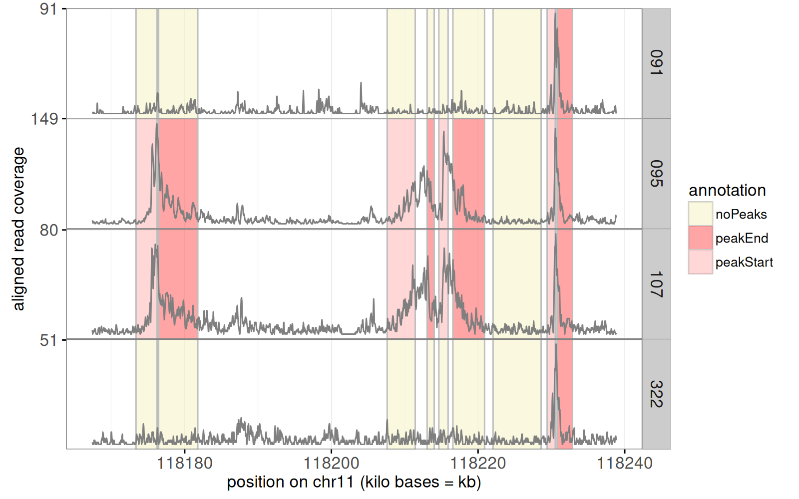
We begin by a plot of some genomic ChIP-seq data, which are sequential data that take large values when there is an active area (typically actively transcribed genes).
<!-- comment -->
In the code below we use show each sample in a separate panel.
<!-- paragraph -->
```{r}
library(animint2)
ann.colors <- c(
  noPeaks="#f6f4bf",
  peakStart="#ffafaf",
  peakEnd="#ff4c4c",
  peaks="#a445ee")
(gg.cov <- ggplot()+
  scale_y_continuous(
    "aligned read coverage",
    breaks=function(limits){
      floor(limits[2])
    })+
  scale_x_continuous(
    "position on chr11 (kilo bases = kb)")+
  coord_cartesian(xlim=c(118167.406, 118238.833))+
  geom_tallrect(aes(
    xmin=chromStart/1e3, xmax=chromEnd/1e3,
    fill=annotation),
    alpha=0.5,
    color="grey",
    data=PSJ$filled.regions)+
  scale_fill_manual(values=ann.colors)+
  theme_bw()+
  theme(panel.margin=grid::unit(0, "cm"))+
  facet_grid(sample.id ~ ., labeller=function(df){
    df$sample.id <- sub("McGill0", "", sub(" ", "\n", df$sample.id))
    df
  }, scales="free")+
  geom_line(aes(
    base/1e3, count),
    data=PSJ$coverage,
    color="grey50"))
```
<!-- paragraph -->
The figure above shows the raw noisy data as a grey `geom_line()`.
<!-- comment -->
Colored rectangles represent labels that indicate whether or not a peak start or end should be predicted in a given region and sample.
<!-- comment -->
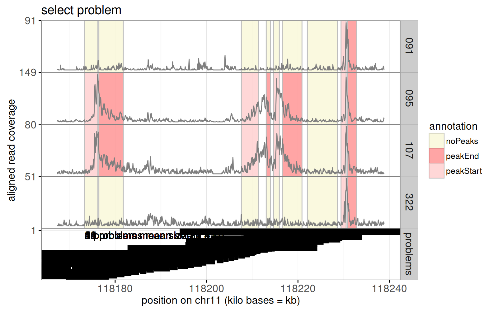
Next, we add a panel for segmentation problems, in which an algorithm looked for a common peak across samples.
<!-- comment -->
The algorithm predicts start/end positions for a peak of large data values, in each problem.
<!-- comment -->
The code below computes a table with one row for each such problem.
<!-- paragraph -->
```{r}
library(data.table)
(show.problems <- data.table(PSJ$problems)[
, y := problem.i/max(problem.i), by=bases.per.problem][])
```
<!-- paragraph -->
The code above added the `y` column which is used to display the problems in the code below.
<!-- paragraph -->
```{r}
(gg.cov.prob <- gg.cov+
  ggtitle("select problem")+
  geom_text(aes(
    chromStart/1e3, 0.9,
    label=sprintf(
      "%d problems mean size %.1f kb",
      problems, mean.bases/1e3)),
    showSelected="bases.per.problem",
    data=PSJ$problem.labels,
    hjust=0)+
  geom_segment(aes(
    problemStart/1e3, y,
    xend=problemEnd/1e3, yend=y),
    showSelected="bases.per.problem",
    clickSelects="problem.name",
    size=5,
    data=show.problems))
```
<!-- paragraph -->
Above we see a bottom `problems` panel was added to the previous plot.
<!-- comment -->
The static graphic above is overplotted; the interactive version will be readable because it will only show one value of `bases.per.problem` at a time.
<!-- comment -->
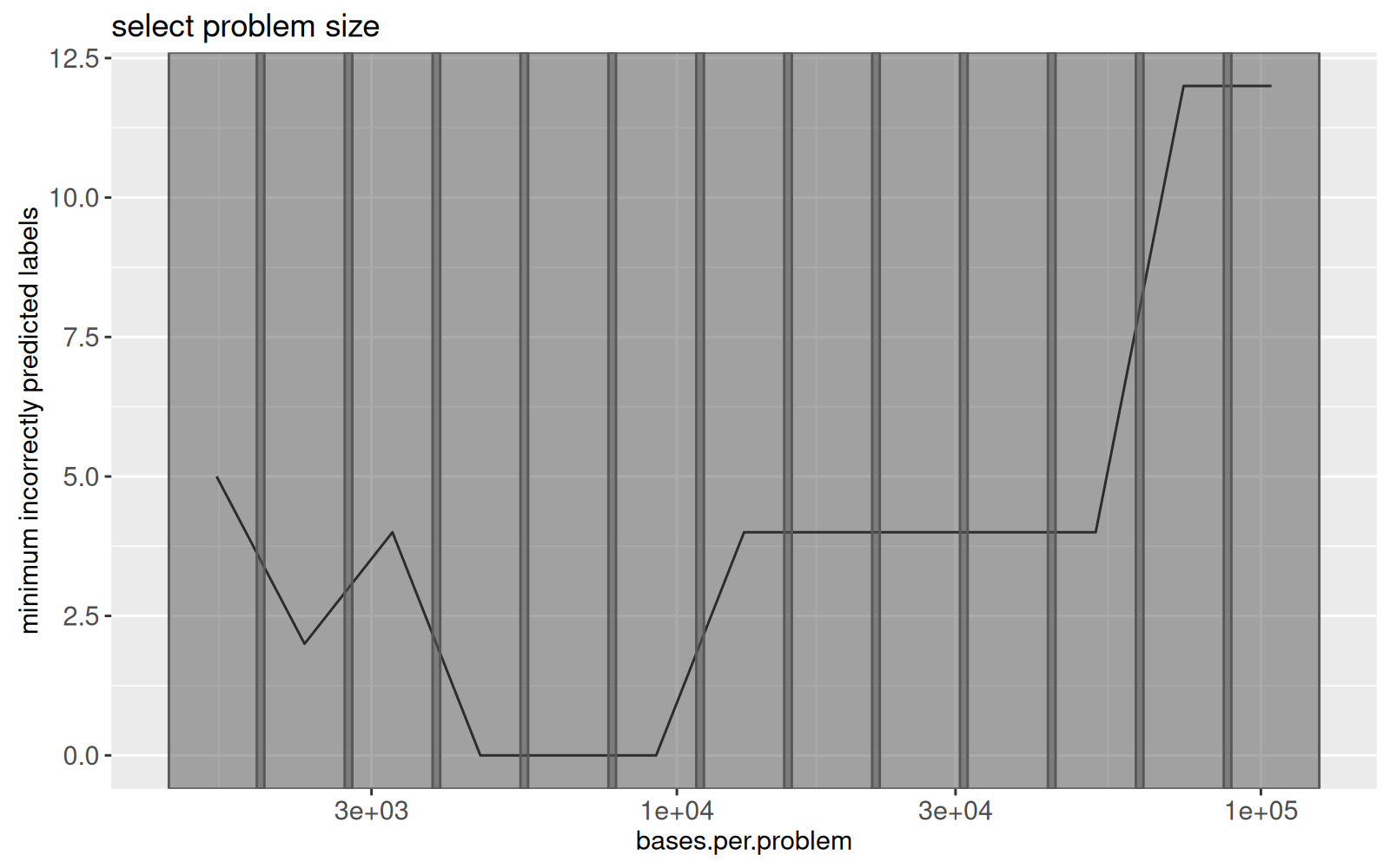
To select the different values of `bases.per.problem` (problem size), we will use another plot, which shows the best error rate for each problem size, as in the data below.
<!-- paragraph -->
```{r}
(res.error <- data.table(PSJ$error.total.chunk))
```
<!-- paragraph -->
The table above has one row per value of `bases.per.problem`, which is a sliding window size parameter, that we will explore with interactivity.
<!-- comment -->
We use these data to draw the plot below.
<!-- paragraph -->
```{r}
(gg.res.error <- ggplot()+
  ggtitle("select problem size")+
  ylab("minimum incorrectly predicted labels")+
  geom_line(aes(
    bases.per.problem, errors),
    data=res.error)+
  geom_tallrect(aes(
    xmin=min.bases.per.problem,
    xmax=max.bases.per.problem),
    clickSelects="bases.per.problem",
    alpha=0.5,
    data=res.error)+
  scale_x_log10())
```
<!-- paragraph -->
The figure above shows the minimum number of label errors as a function of problem size.
<!-- comment -->
Grey rectangles will be used to select the problem size.
<!-- paragraph -->
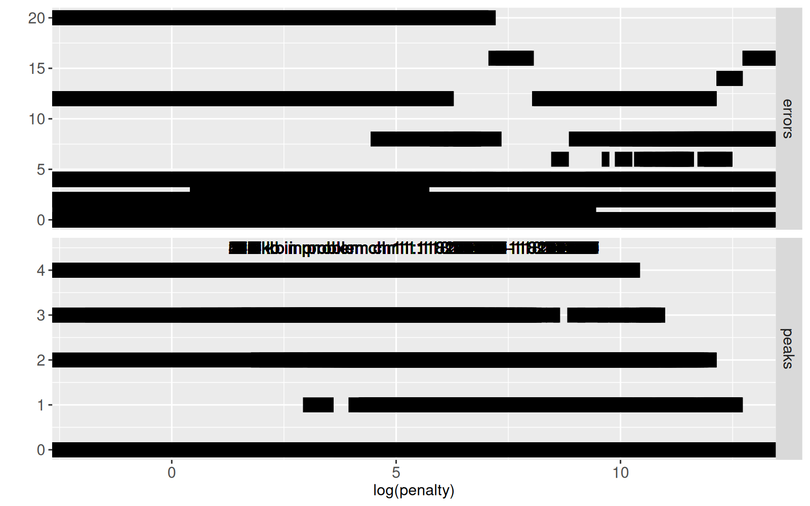
There is a penalty parameter which controls the number of samples with a common peak, as defined in the model selection data table in the code below.
<!-- paragraph -->
```{r}
pdot <- function(L){
  out_list <- list()
  for(i in seq_along(L)){
    out_list[[i]] <- data.table(
      problem.dot=names(L)[[i]], L[[i]])
  }
  rbindlist(out_list)
}
(all.modelSelection <- pdot(PSJ$modelSelection.by.problem))
```
<!-- paragraph -->
The code above uses the `pdot()` function, which uses the [list of data tables idiom](/ch99#list-of-data-tables) to add a column named `problem.dot`, which will be used below to define selectors in the interactive visualization.
<!-- comment -->
Below we plot the number of peaks and label errors, as a function of penalty parameter of the algorithm.
<!-- paragraph -->
```{r}
long.modelSelection <- melt(
  data.table(all.modelSelection)[, errors := as.numeric(errors)],
  measure.vars=c("peaks","errors"))
log.lambda.range <- all.modelSelection[, c(
  min(max.log.lambda), max(min.log.lambda))]
modelSelection.labels <- unique(all.modelSelection[, data.table(
  problem.name,
  bases.per.problem,
  problemStart,
  problemEnd,
  log.lambda=mean(log.lambda.range),
  peaks=max(peaks)+0.5)])
(gg.model.selection <- ggplot()+
   scale_x_continuous("log(penalty)")+
   geom_segment(aes(
     min.log.lambda, value,
     xend=max.log.lambda, yend=value),
     showSelected=c("bases.per.problem", "problem.name"),
     data=long.modelSelection,
     size=5)+
   geom_text(aes(
     log.lambda, peaks,
     label=sprintf(
       "%.1f kb in problem %s",
       (problemEnd-problemStart)/1e3, problem.name)),
     showSelected=c("bases.per.problem", "problem.name"),
     data=data.frame(modelSelection.labels, variable="peaks"))+
   ylab("")+
   facet_grid(variable ~ ., scales="free"))
```
<!-- paragraph -->
The figure above shows `errors` (top panel) and `peaks` (bottom panel) as a function of `log(penalty)`.
<!-- comment -->
Again this static version is overplotted; interactivity will be used so that this figure is readable (only shows the subset of data corresponding to the selected values of`bases.per.problem` and `problem.name`).
<!-- paragraph -->
## Interactive data visualization (incomplete) {#incomplete}
<!-- paragraph -->
In this section, we combine the ggplots from the previous section into a linked interactive data visualization.
<!-- comment -->
The code below uses `theme_animint()` to attach some display options to the previous coverage plot, and adds the `first` option to specify what data subsets should be displayed first.
<!-- paragraph -->
```{r}
timing.incomplete.construct <- system.time({
  coverage.counts <- table(PSJ$coverage$sample.id)
  facet.rows <- length(coverage.counts)+1
  viz.incomplete <- animint(
    first=list(
      bases.per.problem=6516,
      problem.name="chr11:118174946-118177139"),
    coverage=gg.cov.prob+theme_animint(
      last_in_row=TRUE, colspan=2,
      width=800, height=facet.rows*100),
    resError=gg.res.error,
    modelSelection=gg.model.selection)
})
```
<!-- paragraph -->
The timing output above shows that the initial definition is fast.
<!-- comment -->
Rendering this preliminary (incomplete) data viz in the code below is also fast.
<!-- paragraph -->
```{r ch14incomplete}
before.incomplete <- Sys.time()
viz.incomplete
cat(elapsed.incomplete <- Sys.time()-before.incomplete, "seconds\n")
```
<!-- paragraph -->
We see a data visualization above with three plots.
<!-- paragraph -->
- On top, four ChIP-seq data profiles are shown, along with a problems panel which divides the X axis into problems in which the segmentation algorithm runs.
<!-- comment -->
- Clicking the bottom left plot selects problem size, which updates the problems displayed on top.
<!-- comment -->
- The bottom right plot shows the number of peaks and errors as a function of penalty (larger for fewer peaks).
<!-- paragraph -->
## Add interactivity using for loops {#define-using-for-loops}
<!-- paragraph -->
In this section, we add layers to the previous ggplots using a for loop, which is sub-optimal, but we show it for comparison with the better approach (named `clickSelects` and `showSelected`) which is presented in the next section.
<!-- comment -->
The visualization in the previous section is incomplete.
<!-- comment -->
We would like to add
<!-- paragraph -->
- rectangles in the bottom left plot which would allow us to select the number of peaks predicted in the given problem.
<!-- comment -->
- segments and rectangles in the top plot which would show the predicted peaks and label errors.
<!-- paragraph -->
One (inefficient) way of adding those would be via a for loop, which is coded below.
<!-- comment -->
For every problem there is a selector (called `problem.dot`) for the number of peaks in that problem.
<!-- comment -->
So in this for loop we add a few layers with `clickSelects="problem.dot"` or `showSelected="problem.dot"` to the `coverage` and `modelSelection` plots.
<!-- paragraph -->
```{r}
viz.first <- viz.incomplete
viz.first$first <- c(viz.incomplete$first, PSJ$first)
viz.first$modelSelection <- viz.first$modelSelection+
  ggtitle("select number of samples with peak in problem")
print(timing.for.construct <- system.time({
  viz.for <- viz.first
  viz.for$title <- "PSJ with for loops"
  for(problem.dot in names(PSJ$modelSelection.by.problem)){
    if(problem.dot %in% names(PSJ$peaks.by.problem)){
      peaks <- PSJ$peaks.by.problem[[problem.dot]]
      peaks[[problem.dot]] <- peaks$peaks
      prob.peaks.names <- c(
        "bases.per.problem", "problem.i", "problem.name",
        "chromStart", "chromEnd", problem.dot)
      prob.peaks <- unique(data.frame(peaks)[, prob.peaks.names])
      prob.peaks$sample.id <- "problems"
      viz.for$coverage <- viz.for$coverage +
        geom_segment(aes(
          chromStart/1e3, 0,
          xend=chromEnd/1e3, yend=0),
          clickSelects="problem.name",
          showSelected=c(problem.dot, "bases.per.problem"),
          data=peaks, size=7, color="deepskyblue")
    }
    modelSelection.dt <- PSJ$modelSelection.by.problem[[problem.dot]]
    modelSelection.dt[[problem.dot]] <- modelSelection.dt$peaks
    viz.for$modelSelection <- viz.for$modelSelection+
      geom_tallrect(aes(
        xmin=min.log.lambda,
        xmax=max.log.lambda),
        clickSelects=problem.dot,
        showSelected=c("problem.name", "bases.per.problem"),
        data=modelSelection.dt, alpha=0.5)
  }
}))
```
<!-- paragraph -->
Note the timing of the code above, which just evaluates the R code that defines this data viz.
<!-- comment -->
Next, we compile the data visualization.
<!-- paragraph -->
```{r ch14for}
before.for <- Sys.time()
viz.for
cat(elapsed.for <- Sys.time()-before.for, "seconds\n")
```
<!-- paragraph -->
Note that the compilation takes several seconds, since there are so many geoms (click Show download status table to see all of them).
<!-- comment -->
Compared to the data visualization from the previous section, this one has
<!-- paragraph -->
- blue segments that appear in the top coverage data plot, to indicate predicted peaks.
<!-- comment -->
- selection rectangles that can be clicked in the bottom right plot, to change the number of samples with a peak in the selected problem.
<!-- paragraph -->
In the next section we will create the same data viz, but more efficiently.
<!-- paragraph -->
## Add interactivity using named `clickSelects` and `showSelected` {#define-using-named}
<!-- paragraph -->
In this section we use named `clickSelects` and `showSelected` to create a more efficient version of the previous data visualization.
<!-- comment -->
In general, any data visualization defined using for loops in R code can be made more efficient by instead using this method.
<!-- comment -->
First, we define some common data.
<!-- paragraph -->
```{r}
(sample.peaks <- pdot(PSJ$peaks.by.problem))
```
<!-- paragraph -->
The output above shows a table with one row per peak that can be displayed, for different samples, problems, and interactive choices of `bases.per.problem` and `peaks` parameters.
<!-- comment -->
Note the `problem.dot` column which defines the name of the selector that will store the currently selected number of peaks for that problem.
<!-- paragraph -->
In the code below, the main idea is that for every problem, there is a selector defined by the `problem.dot` column, for the number of peaks in that problem.
<!-- comment -->
We use `showSelected=c(problem.dot="peaks")` and `clickSelects=c(problem.dot="peaks")` to indicate that the selector name is found in the `problem.dot` column, and the selection value is found in the `peaks`column.
<!-- comment -->
The`animint2dir()` compiler creates a selection variable for every unique value of `problem.dot` (and it uses corresponding values in `peaks` to set/update the selected value/geoms).
<!-- paragraph -->
```{r}
print(timing.named.construct <- system.time({
  viz.named <- viz.first
  viz.named$title <- "PSJ named clickSelects and showSelected"
  viz.named$coverage <- viz.named$coverage+
    geom_segment(aes(
      chromStart/1e3, 0,
      xend=chromEnd/1e3, yend=0),
      clickSelects="problem.name",
      showSelected=c(problem.dot="peaks", "bases.per.problem"),
      data=sample.peaks, size=7, color="deepskyblue")
  viz.named$modelSelection <- viz.named$modelSelection+
    geom_tallrect(aes(
      xmin=min.log.lambda,
      xmax=max.log.lambda),
      clickSelects=c(problem.dot="peaks"),
      showSelected=c("problem.name", "bases.per.problem"),
      data=all.modelSelection, alpha=0.5)
}))
```
<!-- paragraph -->
It is clear that it takes much less time to evaluate the R code above which uses the named `clickSelects` and `showSelected`.
<!-- comment -->
We compile it below.
<!-- paragraph -->
```{r ch14named}
before.named <- Sys.time()
viz.named
cat(elapsed.named <- Sys.time()-before.named, "seconds\n")
```
<!-- paragraph -->
The animint produced above should appear to be the same as the other data viz from the previous section.
<!-- comment -->
The timings above show that named `clickSelects` and `showSelected` are much faster than for loops, in both the definition and compilation steps.
<!-- paragraph -->
## Disk usage comparison {#disk-usage}
<!-- paragraph -->
In this section we compute the disk usage of both methods.
<!-- paragraph -->
```{r}
viz.dirs.vec <- c("ch14incomplete", "ch14for", "ch14named")
viz.dirs.text <- paste(viz.dirs.vec, collapse=" ")
(cmd <- paste("du -ks", viz.dirs.text))
(kb.dt <- fread(cmd=cmd, col.names=c("kilobytes", "path")))
```
<!-- paragraph -->
The table above shows that the data viz defined using for loops takes about twice as much disk space as the data viz that used named `clickSelects` and `showSelected`.
<!-- paragraph -->
## Chapter summary and exercises {#ch14-exercises}
<!-- paragraph -->
The table below summarizes the disk usage and timings presented in this chapter.
<!-- paragraph -->
```{r}
data.table(
  kb.dt,
  construct.seconds=c(
    timing.incomplete.construct[["elapsed"]],
    timing.for.construct[["elapsed"]],
    timing.named.construct[["elapsed"]]),
  compile.seconds=as.numeric(c(
    elapsed.incomplete,
    elapsed.for,
    elapsed.named)))
```
<!-- paragraph -->
It is clear from the table above that named `clickSelects` and `showSelected` are more efficient in both respects, and should be used instead of for loops.
<!-- paragraph -->
Exercises:
<!-- paragraph -->
- Use named `clickSelects` and `showSelected` to create a visualization which demonstrates over- and under-fitting, as in [this visualization of linear model and nearest neighbors](https://tdhock.github.io/2023-12-04-degree-neighbors/).
<!-- comment -->
- Use named `clickSelects` and `showSelected` to create a visualization of some data from your domain of expertise.
<!-- paragraph -->
Next, [Chapter 15](/ch15) explains how to visualize root-finding algorithms.
<!-- paragraph -->